Wednesday, 22 February 2017

Modernism lecture pt.1

Modernity and Modernism

  • john ruskin 1819-1900 - wrote a book called modern paintings, argued that modern artworks weren't as good as old masters, his favourite painters were the pre raphelites who were about rejecting the modern techniques and going back to a style pre-Raphael 
  • our culture implies to modernise is to make things better 
  • to be modern originally just meant to be of your time
  • paris 1900, paris was the epicentre of modernity, it was THE modern city. it was replaced in the 50s by new york 
  • urbanisation - a condensation of life in cities - moving away from farming. an alienated sense of existence. life becomes accelerated and regulated.
  • before this era time was not standardised, GMT comes in, the telephone is invented, electric light is invented. humanity is shifting the rules of nature 
  • 1750 - mid 20th century = 
  • cities as they developed had an imperialist competitive streak particularly between France and britan
  • enlightenment - period in late 18th century when scientific/philosophical thinking made leaps and bounds
  • secularisation - turning away from religion and to science
  • cities become the epicentre of life
  • caillebotte 'paris on a rainy day' this is the new paris, the paris of modernity. the painting shows 1850s new paris architecture.
    Related image
  • haussman redesigns paris, large boulevards in favour of narrow streets - made the streets easier to police, a form of social control
  • the centre of paris becomes gentrified for the richer classes and the outskirts are for the working class 
  • seurat 'ísle de la grande jatte' capitalism is turning us into faceless zombies. invented an anti expressive technique of making, no creativity just dot dot dot, no expressiveness, you can become just another cog in the machine 
  • bathers at asnieres - in the background the dominant factory. clocking on and clocking off dominates your existing. trying desperately to find life outside of work. social distinctions being created by the common wealth
  • degas 'absinthe driker' about literally drinking away your sorrows to forget about work, in company but simultaneously alone 
  • kaiserpanorama 1883 shows landscapes, sometimes art, almost collective but at the same time entirely individualised 
  • max nordau degeneration 1982 anti modernism, he predicted 'By the end of the 20th Century 1there will be a generation to whom it will not be injurious to. ... a dozen quire of newspapers daily, to be constantly called to the telephone... and to live half their time in a railway carriage or in a flying machine.'
  • alfred stieglitz 'in the new York central yards' photography is invented and almost makes painting redundant art as to change to transform into something else, become more emotive, more abstract
  • etienne, hules marey, chronophotographic gun 1882, running man, proved horses run with all 4 feet on the ground 
  • people experimenting at this time with new technologies, complex dialogue between new technologies and ways of making 
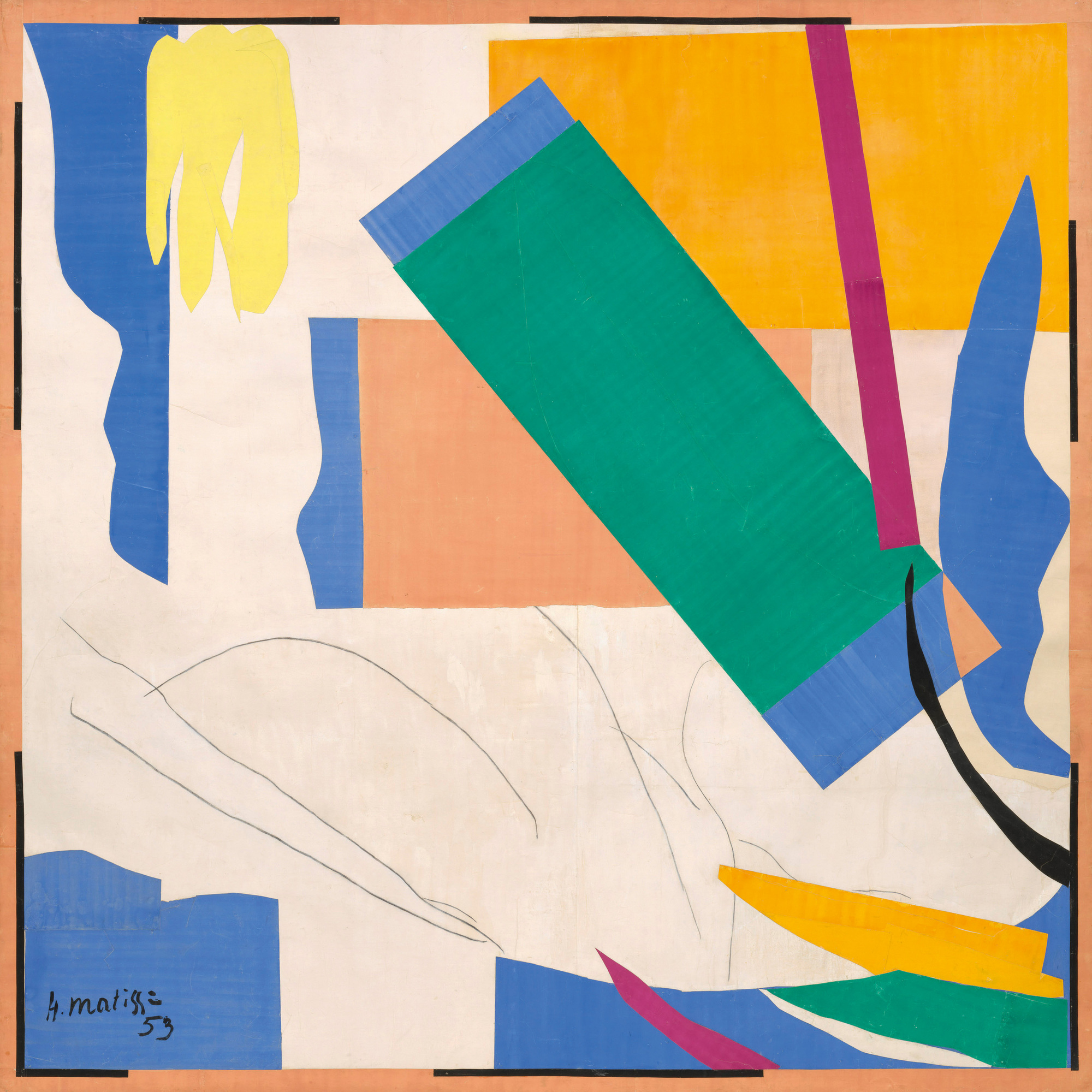
  • picasso - les demoiselles Dávignon 1907 a response to the threat of photography, rupture of spacial experience reflective of the modern 

Sunday, 12 February 2017

developments in the sketchbook - paint

I started off abstracting and stripping down famous artistic images like son of man and Mr and Mrs Andrews before actually doing some research into the most expensive paintings ever sold - I thought this would be a good starting point for me to explore a range of relevant imagery. 

I'm  happy so far with how these pieces have turned out and I think they convey interesting messages about the meaning of art and it's value whilst also being visually appealing and successful. However I want to refine my practice further using print and digital means next because I do think the paintings loose something slightly in the quality of the work and I could improve this with digital as well as mdernising the interpretations further with the use of new media. I think both print and digital would be ana ntersting exploration of value and the idea of the hand of the maker, wether repeatability decreases value? a lot of digital art is not considered fine art at all its not highbrow enough, a lot of focus is still placed on hand generated work however simple it may be and it would be interesting to perhaps explore this through using different processes.

Nude green leaves and bust (sold for 106 million dollars)
 pendant portraits - Rembrandt

Lucius Freud - Francis Bacon

picasso

Son of Man - Magritte


Reclining nude with blue cushion


Mr and Mrs andrews - Gainsborough


Friday, 10 February 2017

Study task 7 - rationale

My theme is how the wealthy control and influence culture. I started off exploring this in a variety of ways including sketching, line drawing, painting collage and mixed media before focusing more on shape, colour and abstraction.

I decided to start using print because I think it created a very bold and simplified form of an image that can be repeated but I specifically chose monoprint so as to still add that flair of individuality into each piece and I also really like the texture it creates. I also think that by using mono print I can make my woke more abstract and layered.

I intend to use digital processes such as photoshop and illustrator to develop my ideas and working practises an may end up combining both digital and print towards the end of the book.

Now I have experimented and found a conceptual direction for my work I know I will be sticking with abstract colour and shape based work.

I would say visually I've been inspired by artists such as Anna Kövecses and Henri Matisse who uses really bold and vibrant shapes, specifically the pieces pictured below


Anna Kövecses:
Anna Kövecses

Image result for matisse

Image result for matisse

Henri Matisse: The Cut-Outs


Wednesday, 8 February 2017

colour theory pt2

colour theory - subjective colour, colour and contrast

  • how individually we respond to colour
  • contrast of tone - formed by the juxtaposition of light and dark
  • contrast of hue - the juxtaposing of different hues
  • contrast of saturation - juxtaposing light and dark values and the level of their saturation   
  • contrast of extension - formed by assigning proportional field sizes in relation to the visual weight of the colour (contrast of proportion) trying to balance the amount of colour which will offset another colour
  • contrast of temperature - we assign 'warm' and 'cool' values to colour, we have a psychological sense of blue being a cool colour 
  • complementary contrast - juxtaposing complimentary colours, i.e red and green against each other really starts to hurt your eyes, it becomes optically painful. red and green as complimentaries should never be put together
  • simultaneous contrast - formed when boundaries between colours perceptually vibrate 
  • colour can optically change in front of your eyes and create gradients that don't actually exist 
  • proximity of colour and tone can confuse the eye i.e blue and red                               
  • what we put down as colour isnt nescecarily what we see

Wednesday, 1 February 2017

colour theory lecture

systematic colour (part 1)

  • colour is arguably infinite, tones, hues, shades
  • colour is contextual
  • when we talk about colour its contextual, and dependent on the things around it. its very rare that we see isolated colour its always surrounded by other things that effect how we read that colour
  • when we work we deal with isolated colour 
  • three elements of colour: physical - physiological - psychological
  • physical - the idea of light as a science, optics, refraction.
  • physiological - science meets human, the human interpretation of biology
  • spectral colour is a colour evoked by a wavelength of light within a spectrum, colour is linked to light
  • a single wavelength or very narrow bands create monochromatic light, each colour has its own wavelength
  • every wavelenght of light is a spectral colour in a continuous system
  • there are certain wavelength's we can differentiate between - we see them as the same colour, we can see about 160 million different wavelengths of colour
  • our perception of colour is based on the eye receiving light that's been reflected from a surface
  • rods convey shades of black white and grey, cones allow the brain to perceive colour
  • there are three types of cones 
  • type one - red orange light
  • type two - green light
  • type three blue light
  • yellow doesnt exist its a combination of wavelength
  • the eye can be fooled into seeing the full range of visible colours from red green and blue
  • we cannot know that what one person calls red another can see as the same red

systematic colour part 2


  • Johannes itten (1888 - 1967) the art of colour, studied how colours can be used as a medium in their own right
  • basic design colour
  • colour design workbook
  • colour - pigment - media 
  • primary colours based on mixing physical medium
  • complimentary refer to the chromatic opposite of one colour, e.g. the opposite of yellow is violet. if you mix them together you get a grey/brown mess, they're opposing forces they cancel each other out and leave an absence of colour. they cancel out each others wavelengths 
  • the wheel shows the complimentaries directly opposite each other 
  • optical mixing we cannot differentiate between spectral yellow and combination of red and green
  • colour modes: RGB - relating to light and used for screen, CMYK - physical and can be printed to paper
  • subtractive colour (print paint and medium) and additive colour (RGB system)
  • chromatic value = hue + tone + saturation
  • hue - the colour itself, our initial response to a colour, the way we recognise the colour
  • luminance - how bright it is, how much it reflects colour, creates a whole set of shades
  • tint - adding more white to something would create a tint, effects its luminance, it may not be as bright but it will be lighter in terms of its tint, pink is a tint of red
  • tone = tint + shade
  • saturation = the amount of a colour we can see, we can effect a colours saturation by moving it through a hue